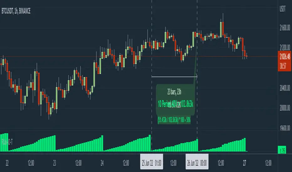
RVol Over Time [vnhilton]I recommend to do the following to give you indicator values at a better glance & for a cleaner chart: 1) Turn off labels on price scale. 2) Turn down opacity for Rvol-O-T down to 0%. 3) Move the indicator to the chart pane or to the volume pane. 4) Pin the indicator to scale A (same scale as the price chart/pane). Now you can only see the RVol-O-T on the top left.
Relative Volume (RVol) is an indicator that compares current volume with Average Daily Volume (ADV) for a set period of time. This can be used to find tickers in play, as those trading with an RVol >1 means it's trading above average volume, which may be worthy of your attention.
This indicator calculates RVol as the day progresses, which may be useful if you have strategies with an intraday criterion e.g. the ticker needs to be trading at Rvol > 2, 30 minutes after the open for stocks (You can see RVol in % or float form).
The chart snapshot image above shows BTCUSDT. Reason for this ticker is because for cryptocurrencies & forex pairs, market data is complete so this indicator can work correctly. If you try this indicator on stocks, indices or futures, you may notice that there's a discrepancy between daily volume candles & the summation of intraday candles (they don't equate each other - huge difference between the 2), causing the indicator to not work as effectively. To solve this problem, you would have to get extra market data from TradingView, or to integrate your broker with TradingView to pass along your broker's data feed (provided your broker also has real-time data - if not you may need to get extra market data via the broker).
Buscar en scripts para "relative volume"
VP and POCThis code is credited to juliangonzaconde. Have taken his help to modify his beautiful creation.
Volume profile is a key study when comes to understanding the auction trading process. Volume Profiles will show you exactly how much volume, as well as relative volume, occurred at each price as well as the exact number of contracts for the entire session. It is a visualization tool to understand the high activity zone and low activity zone.
Volume profile measures the confidence of the traders in the market. From short term trading perspective monitoring the developing volume profile in realtime make more sense to track current market participation behavior to take better trading decisions.
Hope this helps you in trading on daily timeframe.
Happy Trading.
Delta-RSI Strategy (with filters)Delta-RSI Strategy (with filters):
This is a version of the Delta-RSI Oscillator strategy with several criteria available to filter entry and exit signals. This script is also suitable for backtesting over a user-defined period and offers several risk management options (take profit and stop loss).
Since the publication of the Delta-RSI Oscillator script, I have been asked many times to make it compatible with the Strategy Tester and add filtering criteria to minimize "false" signals. This version covers many of these requests. Feel free to insert your favorite D-RSI parameters and play around!
ABOUT DELTA-RSI
Delta-RSI represents a smoothed time derivative of the RSI designed as a momentum indicator (see links below):
INPUT DESCTIPTION
MODEL PARAMETERS
Polynomial Order : The order of local polynomial used to interpolate the relative strength index (RSI).
Length : The length of the lookback frame where local regression is applied.
RSI Length : The timeframe of RSI used as input.
Signal Length : The signal line is a EMA of the D-RSI time series. This input parameter defines the EMA length.
ALLOWED ENTRIES
The strategy can include long entries, short entries or both.
ENTRY AND EXIT CONDITIONS
Zero-crossing : bullish trade signal triggered when D-RSI crosses zero from negative to positive values (bearish otherwise)
Signal Line Crossing : bullish trade signal triggered when D-RSI crosses from below to above the signal line (bearish otherwise)
Direction Change : bullish trade signal triggered when D-RSI was negative and starts ascending (bearish otherwise)
APPLY FILTERS TO
The filters (described below) can be applied to long entry, short entry and exit signals.
RELATIVE VOLUME FILTER
When activated, the D-RSI-driven entries and exits will be triggered only if the current volume is greater than N times the average over the last M bars.
VOLATILITY FILTER
When activated, the D-RSI-driven entries and exits will be triggered only if the N-period average true range, ATR, is greater than the M-period ATR. If N < M, this condition implies increasing volatility.
OVERBOUGHT/OVERSOLD FILTER
When activated, the D-RSI-driven entries and exits will be triggered only if the value of 14-period RSI is in the range between N and M.
STOP LOSS/TAKE PROFIT
Fixed and trailing stop loss as well as take profit options are available.
FIXED BACKTESTING START/END DATES
If the checkboxes are not checked, the strategy will backtest all available price bars.
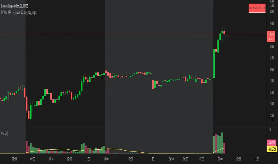
DTR vs ATR w RVolDTR vs ART along with Relative Volume in Percentage. So if you see RVol as 200% with input length of 10 days, today's volume is 2x compared to past 10 days. It helps if today's volume is already reached 20% or 30% within 30mins of market open, etc.
volume changesThis is based upon Daveatt script
I change the volume to VPT as I see this as more accurate .. the rest is same
Thanks Dave you have the best script here:)
green is bullish
red is bearish
I just wonder if we can filter some bad signals? then it would be much better

SMC Flow: Order Blocks & FVGDescription:
This indicator is designed to identify key liquidity zones based on Smart Money Concepts (SMC). It focuses on identifying high-probability reversal and continuation areas by tracking Order Blocks and Price Imbalances.
Key Features:
Order Blocks (OB): Automatically identifies supply and demand zones. The script filters for candles with high relative volume (above 20-period SMA) to ensure the zone represents significant market activity.
Fair Value Gaps (FVG): Detects 3-candle imbalance structures where price moved rapidly, leaving "gaps" that often act as magnets for future price action.
Structure Tracking: Includes a visual step-line based on the highest high and lowest low of the last 10 bars to help traders identify the current market bias.
How to use:
Demand/Supply Zones: Look for Price Action confirmation when the market returns to the highlighted Order Block boxes.
Efficiency: Use FVG boxes to identify where the market is "unbalanced." These areas often get filled before a trend continues.
Confluence: This tool is most effective when used in alignment with higher timeframe analysis and additional technical filters.

Momentum Pro (Tuned v6)Momentum Pro (Tuned v6) is an intraday momentum strategy designed to capture high-quality continuation moves while aggressively filtering out chop and low-participation setups. It combines trend alignment, volume confirmation, momentum strength, and volatility-based risk control into a single rules-driven system.
The strategy is optimized for 1–5 minute charts on liquid stocks and ETFs and is intended for short-term trading, not mean reversion or scalping.
Momentum Pro requires price to be above session VWAP and EMA(8) to be above EMA(18), ensuring trades align with the dominant intraday trend. Momentum quality is confirmed using the MACD histogram and an RSI entry band that favors strength without chasing overextended moves. Relative Volume must exceed a strict threshold to ensure real participation, and ADX is used to avoid low-trend, choppy conditions.
Entries occur only on confirmed breakouts above recent highs, reducing false signals during consolidation. Risk is managed using an ATR-based stop that adapts to volatility, paired with a fixed reward-to-risk profit target to enforce positive expectancy. Optional early exits are included to protect profits if momentum fades or price loses VWAP.
This strategy is not predictive and does not attempt to call tops or bottoms. It is designed to trade only when multiple conditions align, favoring fewer, higher-quality trades over frequency. It works best when used with a higher-timeframe market bias and strict risk discipline.

Options Liquidity Meter (OLM)❓ The question behind this indicator
When trading options, it is common to experience situations where price moves in the expected direction, yet the option contract does not increase in value as anticipated.
This typically happens when one or more of the following conditions is missing:
Insufficient liquidity participation
Lack of volatility expansion
Weak or passive order flow
Options Liquidity Meter (OLM) was created to address this specific question:
“If price moves from here, are there conditions for option premiums to actually expand?”
🎯 What this indicator does
Options Liquidity Meter is a context tool, not a trading system.
It evaluates whether the current market environment is favorable for option premium expansion , based on three core engines:
Liquidity (Relative Volume)
Measures whether price movement is supported by meaningful participation.
Volatility State
Identifies compression, release, and expansion phases, where options tend to respond differently.
Order Flow Activity (OBV-based)
Acts as a proxy for active vs. passive participation, helping filter hollow moves.
These components are combined into a single, easy-to-read options context.
🟢🟡🔴 Options Context Output
The indicator displays one consolidated state:
RED — NO EXPANSION
Price may move, but option premiums often do not respond.
YELLOW — BUILDING
Liquidity or volatility is developing. Conditions are improving but not fully aligned.
GREEN — EXPANSION LIKELY
Liquidity, volatility expansion, and active flow are aligned.
This is a favorable environment for option premium expansion.
The same logic is reflected visually through the background color and summarized in the dashboard.
📊 How to read the dashboard
The dashboard shows:
Liquidity: LOW / OK / HIGH
Volatility: COMPRESSED / RELEASED / EXPANDING
Order Flow: FLAT / ACTIVE
Options Context: NO EXPANSION / BUILDING / EXPANSION LIKELY
Below, a Background Color Meaning section explains what each color represents, making the indicator intuitive and educational.
📍 Where to apply this indicator
Options Liquidity Meter must be applied to the underlying asset chart, such as:
Indices (SPY, SPX, QQQ, etc.)
Stocks
Futures
ETFs
It is not designed to be applied to option contracts themselves.
The indicator evaluates the market conditions of the underlying, which are the drivers that influence option premium behavior.
Contract selection (strike, delta, gamma, expiration) remains the trader’s responsibility.
🧠 How to use it
Use your own methodology to define:
Direction
Structure
Entries and exits
Use Options Liquidity Meter to evaluate:
Whether the current environment supports option premium expansion
If the context is RED, be cautious — price may move without rewarding options.
If the context is GREEN, the environment is statistically more favorable for options responsiveness.
🔗 Complementary tools
Options Liquidity Meter is designed to complement, not replace, other tools.
It works well alongside:
Opening Path Selector (EMA200 Context Tool)
For deciding which asset offers the cleanest directional context.
Multi-Tool VWAP + EMAs (Multi-Timeframe) + Key Levels
For in-chart structure, bias, and reference levels.
Each tool addresses a different stage of the decision process and can be used independently.
⚠️ Important notes
This indicator provides context only
It does not generate trading signals
No indicator guarantees results
Use at your own risk.

Hookes Kinetics | IkkeOmarHooke's Kinetics: A Physics-Based Volatility System
This indicator applies the principles of Hooke's Law to financial time series data to model market volatility as a system of potential and kinetic energy.
Theoretical Foundation: Hooke's Law In physics, Hooke's Law states that the force (F) needed to extend or compress a spring by some distance (x) scales linearly with respect to that distance: F = -kx, where k is the spring constant.
Potential Energy (PE): PE = 0.5 * k * x^2 Kinetic Energy (KE): Energy possessed due to motion.
In this system, we treat Price Action as a spring. Compression (Potential Energy): When price consolidates, volatility compresses. The "spring" is being wound up. Energy is accumulated, not released. Release (Kinetic Energy): When price breaks out of compression, potential energy transforms into kinetic energy. The spring snaps back, driving price motion.
Indicator Mechanics The Hooke's Kinetics oscillator visualizes this energy transfer cycle to identify trend origins and exhaustion points.
Accumulating Energy (Potential): The Blue Area represents the buildup of Potential Energy. This occurs during periods of low volatility (consolidation). The algorithm detects when price variance drops below a threshold (representing spring compression) and aggregates this "stored force" over time. As long as the price remains compressed, the Blue potential energy grows.
Energy Conversion (Kinetic Release): The Red Histogram represents Kinetic Energy. When volatility expands significantly (a breakout), the system triggers a release event. The accumulated Blue potential energy is discharged and converted into the Red kinetic spike. This marks the moment the "spring" is released.
Trend Direction & Decay: Once the Kinetic Energy (Red spike) appears, the "explosive" phase is active. As the Red histogram decays (lowers back to zero), the market enters a coasting phase. The trend direction is established by the price movement during the initial Kinetic release. Traders observe the price vector as the Red energy dissipates to confirm the prevailing trend.
Reversion Signals (Bonus): Extreme peaks in Kinetic Energy (exceptionally high Red spikes) indicate a maximum extension of the spring. Just as a physical spring oscillates, extreme kinetic release often precedes a mean reversion. If price action opposes the direction of the Kinetic decay, it signals a likely reversal.
Visual Reference Referencing the chart above: Blue Ramp: Note the linear buildup of the blue area during sideways price action. This is the "loading" phase. Red Spike: Note the immediate drop in Blue and spike in Red coinciding with the green highlight circles on the chart. These are the breakout points. Green Circles: These highlight the specific candles where Potential converted to Kinetic, marking the optimal entry or decision points.
Code Description
The system defines market state using a composite variable "k" (Stiffness), which combines Price Volatility (NATR) and Relative Volume (RVOL).
k_price = range_natr != 0 ? 1.0 - ((natr - lowest_natr) / range_natr) : 0 k = (k_price * price_weight) + (k_vol * vol_weight) Here, we normalize volatility relative to a historical lookback. High values of "k" indicate high compression—this is the "winding" of the spring.
if is_compressed potential_energy := potential_energy + k kinetic_energy := kinetic_energy * DECAY_RATE When the market is tighter than the user-defined "stiff_thresh", the system accumulates Potential Energy. Note that Kinetic Energy actively decays during this phase, simulating friction or inertia slowing down price movement.
else drain_factor = (1.0 - k) transfer = potential_energy * drain_factor potential_energy := potential_energy - transfer kinetic_energy := (kinetic_energy * DECAY_RATE) + (transfer * ENERGY_MULT) This acts as the conservation of energy. We do not reset Potential to zero instantly; we drain it. The "drain_factor" ensures that a violent expansion (low k) drains potential energy faster than a mild move. This transferred energy is scaled up and added to the Kinetic state.
Note - AMPLITUDE MATTERS!
Observe the amplitude of the Kinetic Energy - higher peaks are more significant. Lower values are usually artifacts, but they can indicate mean reversion on a smaller scale while price remains within a range.

Swing Traders Panel: Beta RVOL ATR Market Sector FnG ImtiazHA compact decision-support panel for swing traders combining volatility, relative volume, market & sector regime, and a 3-zone Fear/Greed filter to improve trade context and risk management.

Zee's A+ MOMO BreakThis just shows an indicator when you have a 5 minute momentum candle that breaks PMH under specific parameters, i.e candle size, wick size, relative volume, time of day, etc. It will plot the PMH with a gold line automatically. Entry would be at the close of the MOMO break. I highly encourage you to back test your results and see how strong this setup is. Any questions feel free to comment or reach out, thanks.

ORB + FVG A+ PRO (All-in-One) [QQQ]Configurable ORB + FVG + filters (VIX, ORB range, relative volume) + A+ PRO (retest at the FVG edge + rejection) + anti-fakeout + orange reminder “CONFIRM POC/HVN (Volume Profile)” right when the A+ signal appears

VB Finviz-style MTF Screener📊 VB Multi-Timeframe Stock Screener (Daily + 4H + 1H)
A structured, high-signal stock screener that blends Daily fundamentals, 4H trend confirmation, and 1H entry timing to surface strong trading opportunities with institutional discipline.
🟦 1. Daily Screener — Core Stock Selection
All fundamental and structural filters run strictly on Daily data for maximum stability and signal quality.
Daily filters include:
📈 Average Volume & Relative Volume
💲 Minimum Price Threshold
📊 Beta vs SPY
🏢 Market Cap (Billions)
🔥 ATR Liquidity Filter
🧱 Float Requirements
📘 Price Above Daily SMA50
🚀 Minimum Gap-Up Condition
This layer acts like a Finviz-style engine, identifying stocks worth trading before momentum or timing is considered.
🟩 2. 4H Trend Confirmation — Momentum Check
Once a stock passes the Daily screen, the 4-hour timeframe validates trend strength:
🔼 Price above 4H MA
📈 MA pointing upward
This removes structurally good stocks that are not in a healthy trend.
🟧 3. 1H Entry Alignment — Timing Layer
The Hourly timeframe refines near-term timing:
🔼 Price above 1H MA
📉 Short-term upward movement detected
This step ensures the stock isn’t just good on paper—it’s moving now.
🧪 MTF Debug Table (Your Transparency Engine)
A live diagnostic table shows:
All Daily values
All 4H checks
All 1H checks
Exact PASS/FAIL per condition
Perfect for tuning thresholds or understanding why a ticker qualifies or fails.
🎯 Who This Screener Is For
Swing traders
Momentum/trend traders
Systematic and rules-based traders
Traders who want clean, multi-timeframe alignment
By combining Daily fundamentals, 4H trend structure, and 1H momentum, this screener filters the market down to the stocks that are strong, aligned, and ready.

BC_Monthly Strength ArmorV0001Monthly Strength Armor – Institutional-Grade Monthly Structure & Real-Time Momentum
A non-repainting, multi-timeframe indicator that delivers clean, professional-grade monthly levels and real-time strength analysis — from 1-minute to monthly charts.
Core Features
PMH / PML Rays
True Previous Month High & Low, drawn once per month from the first trading day, extending infinitely right. Glued to price — survives scroll, zoom, and timeframe changes.
RVOL (Relative Volume)
Current month volume vs. average of prior months.
>1.5 → Orange (high conviction)
<1.0 → Gray (stealth mode)
ATR%
Monthly volatility as % of price.
>3% → Red (explosive)
<1.5% → Gray (consolidation)
Strength Score (0–100)
Combines:
Price position in monthly range (40%)
Trend state (HH/HL or LL/LH) (30%)
RVOL (30%)
→ ≥70 = Bullish Armor | ≤30 = Bearish Armor
Bar Coloring & Background Tint
Instant visual bias: Green (bullish), Red (bearish), Gray (neutral).
Proximity Triangles
▲ near PMH | ▼ near PML → breakout/bounce alerts.
Right-Edge Labels
Clean, stacked display: PMH, PML, RVOL, ATR%, Score — always visible.

Apex Edge – Wolfe Wave HunterApex Edge – Wolfe Wave Hunter
The modern Wolfe Wave, rebuilt for the algo era
This isn’t just another Wolfe Wave indicator. Classic Wolfe detection is rigid, outdated, and rarely tradable. Apex Edge – Wolfe Wave Hunter re-engineers the pattern into a modern, SMC-driven model that adapts to today’s liquidity-dominated markets. It’s not about drawing pretty shapes – it’s about extracting precision entries with asymmetric risk-to-reward potential.
🔎 What it does
Automatic Wolfe Wave Detection
Identifies bullish and bearish Wolfe Wave structures using pivot-based logic, symmetry filters, and slope tolerances.
Channel Glow Zones
Highlights the Wolfe channel and projects it forward into the future (bars are user-defined). This allows you to see the full potential of the trade before price even begins its move.
Stop Loss (SL) & Entry Arrow
At the completion of Wave 5, the algo prints a Stop Loss line and a tiny entry arrow (green for bullish, red for bearish). but the colours can be changed in user settings. This is the “execution point” — where the Wolfe setup becomes tradable.
Target Projection Lines
TP1 (EPA): Derived from the traditional 1–4 line projection.
TP2 (1.272 Fib): Optional secondary profit target.
TP3 (1.618 Fib): Optional extended target for large runners.
All TP lines extend into the future, so you can track them as price evolves.
Volume Confirmation (optional)
A relative volume filter ensures Wave 5 is formed with meaningful market participation before a setup is confirmed.
Alerts (ready out of the box)
Custom alerts can be fired whenever a bullish or bearish Wolfe Wave is confirmed. No need to babysit the charts — let the script notify you.
⚙️ Customisation & User Control
Every trader’s market and style is different. That’s why Wolfe Wave Hunter is fully customisable:
Arrow Colours & Size
Works on both light and dark charts. Choose your own bullish/bearish entry arrow colours for maximum visibility.
Tolerance Levels
Adjust symmetry and slope tolerance to refine how strict the channel rules are.
Tighter settings = fewer but cleaner zones.
Looser settings = more frequent setups, but with slightly lower structural quality.
Channel Glow Projection
Define how many bars forward the channel is drawn. This controls how far into the future your Wolfe zones are extended.
Stop Loss Line Length
Keep the SL visible without it extending infinitely across your chart.
Take Profit Line Colors
Each TP projection can be styled to your preference, allowing you to clearly separate TP1, TP2, and TP3.
This isn’t a one-size-fits-all tool. You can shape Wolfe detection logic to match the pairs, timeframes, and market conditions you trade most.
🚀 Why it’s different
Classic Wolfe waves are rare — this script adapts the model into something practical and tradeable in modern markets.
Liquidity-aligned — many setups align with structural sweeps of Wave 3 liquidity before driving into profit.
Entry built-in — most Wolfe scripts only draw the structure. Wolfe Wave Hunter gives you a precise entry point, SL, and projected TPs.
Backtest-friendly — you’ll quickly discover which assets respect Wolfe waves and which don’t, creating your own high-probability Wolfe watchlist.
⚠️ Limitations & Disclaimer
Not all markets respect Wolfe Waves. Some FX pairs, metals, and indices respect the structure beautifully; others do not. Backtest and create your own shortlist.
No guaranteed sweeps. Many entries occur after a liquidity sweep of Wave 3, but not all. The algo is designed to detect Wolfe completion, not enforce textbook liquidity rules.
Probabilistic, not predictive. Wolfe setups don’t win every time. Always use risk management.
High-RR focus. This is not a high-frequency tool. It’s designed for precision, asymmetric setups where risk is small and reward potential is large.
✅ The Bottom Line
Apex Edge – Wolfe Wave Hunter is a modern reimagination of the Wolfe Wave. It blends structural geometry, liquidity dynamics, and algo-driven execution into a single tool that:
Detects the pattern automatically
Provides SL, entry, and TP levels
Offers alerts for hands-off trading
Allows deep customisation for different markets
When it hits, it delivers outstanding risk-to-reward. Backtest, refine your tolerances, and build your watchlist of assets where Wolfe structures consistently pay.
This isn’t just Wolfe detection — it’s Wolfe trading, rebuilt for the modern trader.
Developer Notes - As always with the Apex Edge Brand, user feedback and recommendations will always be respected. Simply drop us a message with your comments and we will endeavour to address your needs in future version updates.
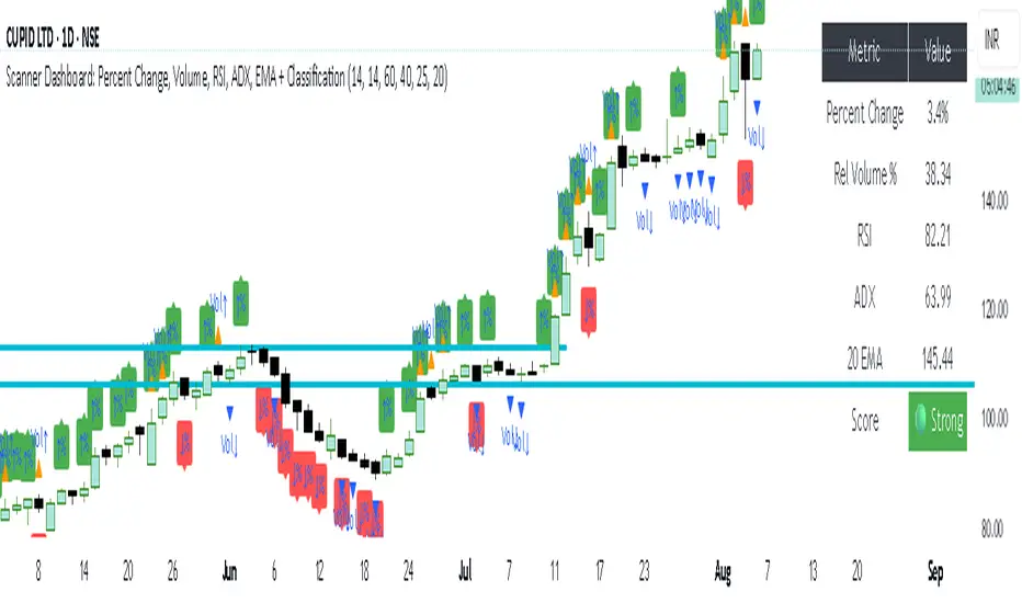
simple trend Scanner Dashboard Script Does
- Calculates key metrics:
- Percent Change from previous day
- Relative Volume (% vs 10-bar average)
- RSI and ADX for strength/trend
- 20 EMA for dynamic support/resistance
- Classifies market condition:
- 🟢 Strong if RSI > 60 and ADX > 25
- 🔴 Weak if RSI < 40 and ADX < 20
- ⚪ Neutral otherwise
- Displays a table dashboard:
- Compact, color-coded summary of all metrics
- Easy to scan visually
- Plots visual signals:
- Arrows and triangles for percent change and volume spikes
- Data window plots for deeper inspection
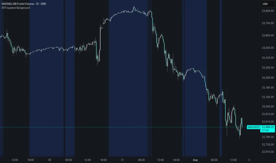
ATR Squeeze BackgroundThis simple but powerful indicator shades the background of your chart whenever volatility contracts, based on a custom comparison of fast and slow ATR (Average True Range) periods.
By visualizing low-volatility zones, you can:
* Identify moments of compression that may precede explosive price moves
* Stay out of choppy, low-momentum periods
* Adapt this as a component in a broader volatility or breakout strategy
🔧 How It Works
* A Fast ATR (default: 7 periods) and a Slow ATR (default: 40 periods) are calculated
* When the Fast ATR is lower than the Slow ATR, the background is shaded in blue
* This shading signals a contraction in volatility — a condition often seen before breakouts or strong directional moves
⚡️ Why This Matters
Many experienced traders pay close attention to volatility cycles. This background indicator helps visualize those cycles at a glance. It's minimal, non-intrusive, and easy to combine with your existing tools.
🙏 Credits
This script borrows core logic from the excellent “Relative Volume at Time” script by TradingView. Credit is given with appreciation.
⚠️ Disclaimer
This script is for educational purposes only.
It does not constitute financial advice, and past performance is not indicative of future results. Always do your own research and test strategies before making trading decisions.
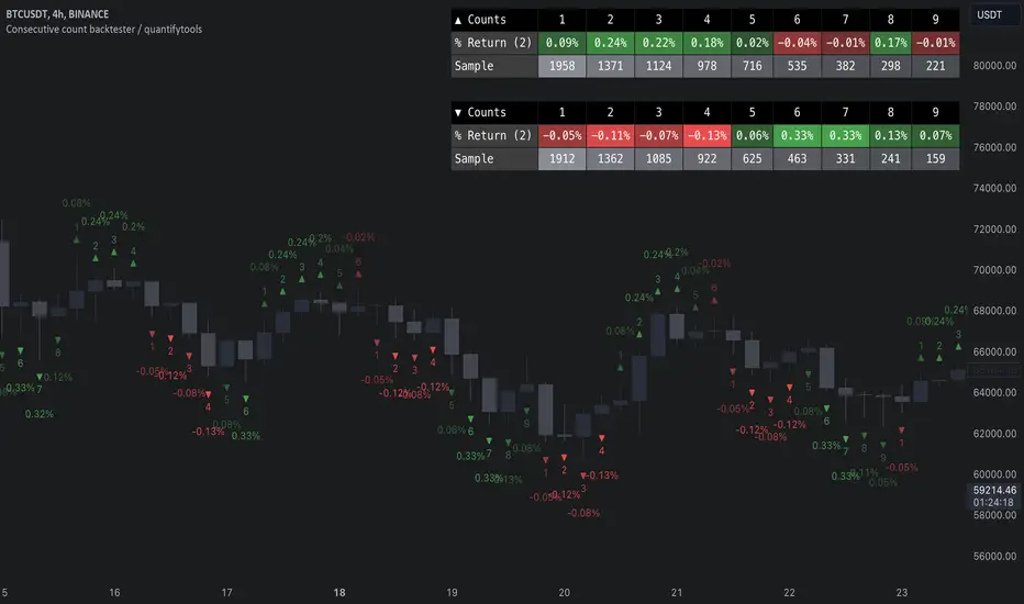
Consecutive count backtester / quantifytools- Overview
Consecutive counting is a simple method to mechanically define trending states to the upside and downside. Consecutive counts are calculated by taking reference price level (e.g. close 4 candles ago) and count closes above/below it up to a maximum count that resets the consecutive count back to 1. This tool provides the means to backtest each count by measuring % change in price after each count (e.g. % gain 2 candles after a given count).
Users can define reference source that starts the consecutive count (e.g. close 4 candles ago), maximum count where counter resets (e.g. after 9th count) and backtesting period (e.g. price change 2 candles after count).
Filters add extra conditions that must be met on the consecutive count to qualify as valid, which are also reflected on the backtest metrics. The counts can be refined using the following filters:
- RSI above/below X
- Price above/below/at moving average of choice
- Relative volume above/below X
Average gain corresponding to each count as they occur can be toggled off for less clutter. Average price change can also be visualized using candle color. Colors, gradient and table/label sizes are fully customizable.
- Practical guide
Example #1: Identify reversal potential
Consecutive counting is a simple yet effective method to for detecting reversals, for which 7-9 counts are traditionally used. Whether that holds true or not can now be put through a test with different variations of the method as well as using additional filters to improve the probability of a turn.
Example #2: Identify trend following potential
Consecutive counts can also have utility value for trend following. When historical short term change is to the downside, expect downside, when to the upside, expect upside.
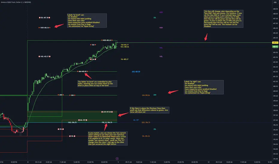
CANDLE LEVELS [PRO]This indicator provides you with 55 levels! with labels to help you identify quickly where current price is in relation to the OPEN, CLOSE, HIGH OF DAY and LOW OF DAY to a respective level. Choose from levels as low as the 5 minute time frame all the way up to 200 days. All of the levels except the day's OPEN, HIGH OF DAY AND LOW OF DAY use the PREVIOUS time frame's level. In other words, when you're looking at the "1 DAY HIGH", that's actually the previous day's HIGH OF DAY. Whether you're a scalper on the lower time frames or a swing trader that mainly uses the 1 hour and above, these candle levels can be an invaluable source of support and resistance; in other words you'll often see price bounce off of a level (whether price is increasing or decreasing) once or multiple times and that could be an indication of a price's direction. Another way that you could utilize this indicator is to use it in confluence with other popular signals, such as an EMA crossover. For instance, you could watch as price rises above the 21 EMA all the while price is also crossing up and over the previous day's HIGH OF DAY with a relative volume that's double that of the previous week's average. These are just a few of some potential bullish signals that you could look for to go long on a trade using the candle levels provided.
I've made this indicator extremely customizable:
⚡Each level has 2 labels: 1 "at level" and 1 "at right", each label and price can be disabled
⚡Each label has its own input for label padding. The "at right" label padding input allows you to zoom in and out of a chart without the labels moving along their respective axis
⚡Each label's text can be customized via an "input.string" code base
⚡Each level's label can be changed via a plot style setting to determine if the label is centered with it's respective level or rides along the top of it
⚡Significant figures input allows you to round price up or down
⚡A "bias EMA" tool that color codes the candles and price line to show you where price is in relation to the 21 EMA (or another value that you pick). As a result, this can be an effective visual to help reduce cognitive load
⚡A "fill level" where color is determined by price opening above or below the previous day's close
⚡A "use current close" setting that's great to use in pre-market as it shows you where price is in relation to the previous days' close
----------------------------------------------------------------------------------------------------------------------
🙏Thanks to (c)satymahajan for the inspiration behind the ATR "previous close" and "bias candle" code base
🙏Thanks to my mentor (c)SimpleCryptoLife for the libraries and extensive code to help create this indicator
Moving Average CandlesInspired by Ricardo Santos's " Multiple Moving Average Candle System V0" ()
This script plots 6 moving averages using the plotcandle function rather than the normal plot function. Result is a stylish indicator that shows moving average crossovers in a more visual way. Moving average type options available are , or Simple, Exponential, Hull, Relative, Volume Weighted, and Arnaud Legoux Moving Averages, Linear Regression Curve, and Median. Lengths for each can be set in settings along with selection specific parameters. Good for plotting/visualizing potential entry/exit points based on your preferred moving averages crossing over, or just as some eye candy.

.b pin-up symbolWhen trading cryptocoins, it is necessary to check the price trend of NASDAQ, BTC.D, BTC.OI, BTC spot or other coins of similar groups.
However it is very cumbersome to put a comparison symbol in the Tradingview chart and combine individual indicators one by one.
Moreover even with such a combination, the chart is messy and visibility is not good.
This script was developed as a composite-solution to that situation, and will make you happy.
- NQ1!, USTECH100CFD | symbol fixed
- BTC.Dominance, BTC.OpenInterest, BTC symbol, others pin-up-symbol | selectable
- Pin-up-symbol | selectable
- Pin-up-symbol's candle chart
- Trending
* EMA 9,21,50,200 ribbon classic EMA
* .b price line ; .b price = unique trending price with price-action + relative-volume-action + ATR
* Dynamic S/R Cloud ; BB + donchian band + high/low + atr mixed custom-logic
* VWWMA + .b price Shadow ; Volume-weighted WMA on .b price = unique MA faster than classic VWMA
Trending shadow direction is not bad even on low-timeframe (1, 2, 3, 5m, 15m...)
- Pattern
* Harmonic Pattern ; A simplified version of the harmonic pattern indicator, simply show-up pattern complete position
for reference only - adopted from HeWhoMustNotBeNamed's script.
- Information Panel
* BTC Dominance, BTC Open Interest, Pin-Up-Symbol price
* Trend meter ; 5,15,30,1h,2h,4h Meter Calc with 1 minute-timeframe candles
5 = Green if the current price is higher than the price 5 minutes ago.
1h = Green if the current price is higher than the price 2 hours ago.
4h = Red if the current price is lower than the price 4 hours ago.
* caution ; To use real-time chart of "CME_MINI:NQ1!" you have to additional subscribe CME data,
default setting is 'NQ1!' , you can change to 'USTECH100CFD'
* When you choose symbol which is closed trading hours, the script's update stopped.
Even if the selected pin-up-symbol is on trading hours, the currently selected symbol's chart doesn't update.
* recommended | chart setting > Appearance : Top margin 0%, Bottom margin 0% for optimized screen usage :)
if you have any questions freely contact to me by message on tradingview, or telegram @sr_bt
but please understand that responses may be quite late.
------------------------------------------------------------------------------------------------------------------------------------------------------------
copyright 2022 (sr_b)
Special thanks to all of contributors of community.
The script (originaly .b) may be freely distributed under the MIT license.
The other classic script code also may be freely distributed under the MIT license.
Simplified Harmonic script part | core adopted from 'Multi ZigZag Harmonic Patterns (HeWhoMustNotBeNamed)' MPL2.0 license
Support and Resistance by CainKellyeCheck out my automatic support and resistance indicator that uses the EMA of price change * relative volume as the bases of pivot search.
It also tells the strength of the support and resistance lines calculated using a 4 times quicker EMA and using its distance from the slower one.
The strongest plotted line has the maximum opacity and the weakest has the minimum opacity inside the given range.
This calculation results in an organic detection of the support and resistance prices.
You can set the distance range in percentage you want to have lines calculated around the current price.
You can set the lines gravity distance inside which they are snapped together: the stronger line pulls the weaker to it by using strength weighted average for the new price value.
You can increase the minimum opacity value in case you only see few lines (but the maximum is 15)
You can change the used price for the lines to Close or High/Low but recommended is to use the average of those two (default)
The distances multiplier helps to get a birds eye view easily when using 4H (or higher) chart and a separate one to use on Daily / Weekly / Monthly for even broader view.
Lines and labels are drawn near the candles so you are still able to zoom in.
Labels are not drawn when their line is barely visible (transparency >= 80)
This indicator has been refined on the 15 minute and 1 hour charts of BTC and other cryptos but it works well in smaller volatility markets as well if the distances are adjusted accordingly.

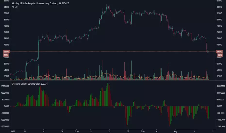
On Beaver Volume SentimentGeneral Market sentiment decoded from two Lazybear OBV's and a CCI.
Lots of strategies with this.
Main point is this indicator tries to be extra sensitive to relative volume changes but keep grounded in sentiment with the cci.
Let me know if you use this!
-Beaverman